Thursday, May 19, 2011

A powerful shorting strategy for the week

If you follow the daily movements of equities, you are often confronted with the case of the price of any given stock rising rapidly. In some of these instances you think to yourself, '...there's no reason for this rise, I know it is going to come back down...' In many cases it does come down, and you wish you had shorted when you had the chance. If only you had a good metric to REALLY know when this move was unjustified and were not forced  to act just on instinct.

Well, you're in luck because I'm going to give you just THAT.

In one of my earlier posts, I gave you the equation for my Share Strength Indicator (SSI), a measure of how much a single share could move the stock price.

http://thequantinvestor.blogspot.com/2011/03/share-strength-indicator-how-much-bang.html

Here, I stated how a high share strength was an indicator that a stock was susceptible to manipulation or uncharacteristically large moves. To test this, lets look at a strategy of shorting stocks that are UP on HIGH share strength. We will short a stock with:

1. A stock price being 10% or more above its 20 DMA price. 


2. A high share strength defined as 20 DMA share strength being greater than 2 standard deviations above the past year's average 20 DMA share strength.

And for the results....

Here we wait 20 days till we cover our short position, and for the results over the past 4 years...

Market          Price Change       Stocks Meeting Criteria
NYSE                 93% (-7%)                       1980
Nasdaq               94% (-6%)                       1272
AMEX                82% (-18%)                       30


Scatter plot of returns for NYSE shorted stocks.


As you can see, once again we have impressive results. If the past 4 years are any indicator, a high share strength along with a big price increase makes for a good time to get in on the short side.

Tuesday, May 10, 2011

A further examination of the 'buy at 52 week high' rule.

Two weeks ago, I demonstrated that the simple strategy of buying any stock at a 52 week high provided the fanciest of returns.
http://thequantinvestor.blogspot.com/2011/04/how-to-lose-money-by-buying-lowor-make.html

I expanded on that last week and showed some amazing gains with a refined strategy.
http://thequantinvestor.blogspot.com/2011/05/perfecting-strategy-of-buying-high.html

In response, I was asked by many readers if there were any specific sell rules, besides waiting a specific amount of time. There wasn't. To respond to my readers, in my post this week I'm going to examine whether, if by implementing a simple 'sell rule', we can further improve upon this already nice performance. For my sell rule, I'm going to implement William O'neil's hard and fast law of selling any stock that has taken an 8% loss, which is followed by many.

To implement my strategy I'll use my same rules as last week:

1. Buy any stock that is at a 52 week high
2. Hold for a specific period of time (1, 3, or 6  months I'll look at here)
3. Sell after that amount of time, or keep if it is still at a 52 week high

and I'll add another rule

4. Sell if, at any point, the stock drops me below an 8% loss (this INCLUDES intraday prices). To make it even more realistic I'll assume 1% slippage meaning I take a 9% loss when trying to sell at an 8% loss.


1 Month Hold
                 1 Year performance       Avg. Return
 NYSE                   +7.4%                     0.6%
 Nasdaq                 -9.0%                    -0.8%
 Amex                   -13.5%                   -1.2%

3 Month Hold
                 1 Year performance       Avg. Return
NYSE                    9.95%                     2.4%
Nasdaq                  2.8%                      0.7%
Amex                    -1.6%                     -0.4%

6 Month Hold
                 1 Year performance       Avg. Return
NYSE                    8.4%                     4.1%
Nasdaq                 3.6%                     1.8%
Amex                    0.4%                     0.2%

As you can see, the implementation of a simple sell rule, in fact, truly hurts our performance. This makes for an interesting point of discussion...if sell rules truly work. In all my experimentation, I've found them to have very little effect. If I remove the slippage effect, the gains become comparable to the normal strategy, but still under-performing.

   Troy

Wednesday, May 4, 2011

Perfecting the strategy of 'buying high' while returning 4381% in ten years!

Last week I demonstrated to my readers that a simple strategy of buying a stock at a 52 week high and holding for any given period of time, can be a very successful LONG investment strategy.
http://thequantinvestor.blogspot.com/2011/04/how-to-completely-outperform-market-by.html

Like any strategy it can be improved on, and in this post I'll try to do just that. Here I'll add another important consideration when buying a stock, the volume backing its price movement. To do that, let me introduce what I call the Volume Moving Average Ratio (VMAR). What this simply is, is the ratio of the 20 day volume moving average to the 75 day volume moving average (you can use other lengths of time as well):

VMAR = VMA(20 day) / VMA(75 day) 

What this tells us is how much the recent average volume is compared to the longer term volume. I used the simple moving average but an exponential would work as well. In theory, a VMAR >> 1 means a stock has significantly more investment activity than usual and, correlated with a price gain, indicates that perhaps its price movement IS warranted.

Now we could potentially cover a huge combination of VMARs and hold times. I'll leave it up to you, the reader, to find the best combination. But now I present to you two scenarios of short (1 or 3 month) hold times with VMARs greater than 1 or 2.

What we see is impressive...enormously impressive. In fact a strategy of 'buying high' backed with volume can make you a very wealthy person. Of course I make no promises, and any strategy that worked last decade may not this decade, and you should consider that. Also, don't forget commissions, as with any trading strategy, can easily take 1-2% off every trade. But these are the facts, and the numbers, and of that I am 100% certain. So here you go...enjoy!


1 Month Hold (VMAR > 1.5) 
                 10 Year performance       Avg. Return      Stocks meeting criteria 
 NYSE                   756%                     1.7%                        1947
 Nasdaq                 597%                     1.5%                       4653
 Amex                  1531%                     2.3%                        885


1 Month Hold (VMAR > 2) 
                 10 Year performance       Avg. Return      Stocks meeting criteria
 NYSE                   4381%                     3.2%                      330
 Nasdaq                  161%                     0.4%                     1507
 Amex                    1936%                     2.5%                      317

3 Month Hold (VMAR > 1.5) 
                 10 Year performance       Avg. Return      Stocks meeting criteria 
 NYSE                   314%                     2.9%                        1005
 Nasdaq                 539%                     4.3%                       2905
 Amex                    918%                     5.7%                        573

3 Month Hold (VMAR > 2) 
                 10 Year performance       Avg. Return      Stocks meeting criteria 
 NYSE                  1068%                     6.1%                        182
 Nasdaq                 248%                     2.3%                       1000
 Amex                    918%                     5.7%                        236


Wednesday, April 27, 2011

How to lose money by buying low...or make money buy shorting low

In my last post http://thequantinvestor.blogspot.com/2011/04/how-to-completely-outperform-market-by.html I outlined the results of a straightforward strategy of buying any stock that was at a 52 week high and selling after a certain amount of time (no fancy stop losses or sell rules). This time I'll examine the more classic strategy of buying low...at a 52 week low to be exact. Here we'll see if buying any stock, when its at its yearly worst, can be profitable

One of my readers pointed out to me that I may have had a survivorship bias in my last analysis. This was an excellent point and to help account for that, this time, I give you the ten year performance of every stock, still listed, on the major exchanges.

NYSE - +11%
Nasdaq - + 2%
Amex - + 14%

(thanks for the input Gary, but the 'buy high' strategy still works!)

So here you go... the performance of the 'buy low' strategy for different holding periods.


1 Month Hold
                 10 Year performance       Avg. Return
 NYSE                   -79%                     -1.3%
 Nasdaq                -70%                     -0.9%
 Amex                   -62%                     -0.8%

3 Month Hold
                 10 Year performance       Avg. Return
NYSE                    -39%                     -1.2%
Nasdaq                 -62%                     -2.4%
Amex                    -75%                     -3.4%

6 Month Hold
                 10 Year performance       Avg. Return
 NYSE                   -64%                     -4.9%
 Nasdaq                -64%                     -4.9%
 Amex                   -67%                     -5.4%

12 Month Hold
                 10 Year performance       Avg. Return
 NYSE                   +30%                     2.7%
 Nasdaq                -37%                     -4.6%
 Amex                   -23%                     -2.6%

As you can see, buying any stock just because it's cheap seems to be a terrible idea (with the exception of a one year NYSE hold). On the other hand, SHORTING any stock or buying a nice put option may work out very well.

The lesson to be learned from this, and my last post, is that the common strategy of 'buy low and sell ***' should be taken with a large grain of salt. I encourage everybody to investigate what I've presented here and develop their own strategies. Money can be made...if you carefully consider what you are doing and don't just follow everybody else.

Sunday, April 24, 2011

How to completely outperform the market by... buying high?

Investing 101 tells you to, 'Buy low and sell high', and there are many, many investors who live by this motto. But is there any truth to it? Or perhaps, might you be better off buying high and selling higher? In this post I'll try to answer that very question by back testing a strategy that goes against that motto.

What I've done is taken all three major exchanges, over the past ten years, and implemented a strategy where I buy any stock that is at a 52 week high. After a certain amount of time I sell it, and perhaps buy it right back if it is again at a 52 week high. I've tested this method over 1, 3, 6, and 12 month holding times for each exchange. To calculate the average return I used the geometric mean to properly account for any volatility.

What I find is quite impressive. In fact, a strategy of buying every stock that is at a 52 week high completely outperformed the market, regardless of how long it is held. For comparison, over the past ten years the Nasdaq has gained 33%, the S&P has gained 2% and the illustrious Berkshire Hathaway A has risen a mere 80%

So here you go... the performance of the 'buy high' strategy for different holding periods.


1 Month Hold
                 10 Year performance       Avg. Return
 NYSE                   230%                     0.7%
 Nasdaq                230%                     0.7%
 Amex                   290%                     0.9%

3 Month Hold
                 10 Year performance       Avg. Return
NYSE                    280%                     2.6%
Nasdaq                 280%                     2.6%
Amex                    290%                     2.7%

6 Month Hold
                 10 Year performance       Avg. Return
 NYSE                   245%                     3.8%
 Nasdaq                212%                     3.2%
 Amex                   177%                     2.4%

12 Month Hold
                 10 Year performance       Avg. Return
 NYSE                   209%                     7.7%
 Nasdaq                158%                     4.7%
 Amex                   167%                     5.3%

An important consideration with each of these strategies are the hidden costs associated with things like commissions. While a 1 or 3 month hold may provide the best returns, you will also be paying significantly more commissions than with a 6 month or 1 year hold strategy. With that in mind I would claim that the 6 month hold strategy is the best, but that depends on what percentage of your investment your commissions take up.

Of course there are no promises of this strategy working over the next ten years, this is just something for you to consider. This strategy also won't make you a millionaire (unless you started with 1/2 a million dollars), but instead seems to be a nice way to slowly grow your money.

********************************
The analysis was run with a new upgrade of my code. It now takes less than one minute to back test a trading strategy over ten years on all three exchanges! With this in mind I invite my readers to propose new trading strategies that I can test and report the performance of on my blog. 

Monday, April 18, 2011

Software Upgrade

Hey All,

So I don't know how much Ill be posting this week because I'm in the process of massively updating my software. I will soon have NYSE, Nasdaq, and Amex data which can completely download in about 10 minutes, real time data if necessarily, advanced statistics and fundamentals, and much faster computing abilities allowing me to back test theories in a fraction of the time


More to come!

           Troy

Thursday, April 14, 2011

Book Review - How to Make Money in Stocks: A Winning System in Good Times and Bad

Today I thought I'd do something different for my post and write a review on the first investing book I ever read. How to Make Money in Stocks by William O'Neal isn't a true quantitative investing (QI) book but instead covers some of the fundamentals that QI was founded on.


The whole book is based around the CAN SLIM parameters for assessing a stock. Many of these are fundamental analyses that don't really apply to this blog. What does apply however is the timing and chart recognition sections, of which there are a lot. He covers how volume should positively correlate with stock price for there to be increases in price, and he introduces his 'cup with handle' pattern as the chart pattern that all great gainers demonstrated. He also discusses other patterns: cups without handles, flags, double bottoms... all of which are rooted in technical analysis. The first section of the book really is the coolest. It's a collection of charts from the best stock over the past century. One thing you'll realize is that market action really hasn't changed nearly as much as you'd think over this time.

The writing is also very straight forward and concise. You don't need a glossary by your side to read the book, nor follow CNBC on a daily basis. The most recent edition was also written post-recession and offers some interesting insight into the whole thing. Sometimes I find it funny to read books written just before the crash...and see how oblivious some of those writers really were...but not with this one.

I really think this is a fantastic book, for both novices and experienced investors. It  taught me a lot about how people think about the market (which is a very important thing to always consider). If you do nothing else with the book, stare at the charts of all the great gainers, look for patterns beyond what he talks about, and learn about what matters to the majority of investors.

Monday, April 11, 2011

10 High Momentum Stocks

In my daily update of the Bat Computer Market Analyzer I give you the momentum of the current Nasdaq market. Momentum measures how much up or down a stock is going on a certain  volume. A highly positive volume means a stock price is rising on high volume while a highly negative momentum means a stock price is falling on high volume.  See here for the equation...

http://thequantinvestor.blogspot.com/2011/03/bat-computer-market-analysis-software.html

I though I'd take that measure and apply it to find the top ten stocks with the highest momentum. The first time I ran this however, I ended up with a whole bunch of stocks that gapped up on high volumes (i.e. from a buyout offer). So I added one caveat, I'd limit it to stocks that haven't gapped up > 1% in the past 10 days (the same period I calculate the volume over). So here it is...the top ten momentum stocks


VDSI    
KEYN
KSWS
ABMD
PPDI
PDLI
AFFX
STKL
SQNM
STEI


...next week we'll check back and see how they do.

Friday, April 8, 2011

Spotty posting

Hi all,

Sorry if my posting is spotty in the next week or so. I'm headed down to Army Research Lab to do some contract work for a while and will be busy moving down/settling in.

   Troy

Monday, April 4, 2011

The Best Hedges

If you've come to this post hoping for a lawn trimming pictorial then I'm sorry if I mislead you.


Often when building a portfolio, investors look to 'hedge' their investments. Wikipedia defines a hedge (finance) as, '...a position established in one market in an attempt to offset exposure to price changes or fluctuations in some opposite position with the goal of minimizing one's exposure to unwanted risk.' The tools of quantitative analysis give us a powerful and simple way to quantify the effective of a hedge. The correlation between the price movements of two stocks tells us how similar the changes in price are. I've already covered the basics of correlations in a previous post, so I won't do it again here. The idea is though, that if we want the stocks to be ideal hedges of each other, we want their price movements to be anti-correlated (correlation coefficient = -1). In short,  if the price of one goes up one day the other should go down, and vise versa.


So today I'll provide you with the top 3 quantitative hedges (Nasdaq only) of some of the most widely held equities in three sectors. Then I'll do something interesting and try to see if these hedges make sense, or if they're some kind of funny coincidence.
_________________________________________________________________________
First up are the 3 best hedges against Google (GOOG),

Symbol               Correlation
SCIL                    -0.8347                - Educational software


ALXA                  -0.8158                - Pharmaceutical company
SXCI                   -0.7897                - Pharmaceutical and healthcare IT

_________________________________________________________________________
Next up are the 3 best hedges against Qualcomm (QCOM),

Symbol               Correlation
THOR                   -0.8936                - Medical device electronics

AMAG                -0.8336                 - Pharmaceutical company
STRA                  -0.7967                 - Post secondary education services

_________________________________________________________________________

Finally are the 3 best hedges against Amgen (AMGN),

Symbol               Correlation
CRUS                   -0.4881               - Electronics
WINA                  -0.4842                - Value retail
VASC                  -0.4058                - Medical Devices


So here's the thing...I see no rhyme or reason for any of these ideal hedges. Perhaps they are merely coincidental hedges or outliers of statistical randomness. Or perhaps they reflect some underlying trading activity. What I hope you get from this post is an understanding that a diversified portfolio can come from non-traditional combinations of equities. Perhaps Jim Cramer is a bit too presumptions in his, 'Are you diversified?' part of the show. Either way, once again, an (anti)correlation analysis is a powerful mathematic tool that you can add to your stock market toolkit.
----

*There are more complicated ways to compute hedges and I will build on those in a later post. Namely, we don't simply want our portfolio to balance itself out and never profit, but we want to minimize fluctuation/risk while maximizing return (see: Sharpe Ratio). Stay tuned...

Thursday, March 31, 2011

10 MORE stocks showing unusual MONEY volume with no price movement...yet

Last week I gave you ten stocks that were showing unusual volume activity but hadn't changed so much in price yet.

http://thequantinvestor.blogspot.com/2011/03/10-stocks-showing-unusual-volume-with.html

Well I though't I'd try and back up my post last week with some results a week later. Below is the one week performance of the stocks I said might rise.

               close(3/23)  close(3/30)
SNBC------3.30------------3.58------ + 8%
PZZI  ------2.00------------2.05------ +3%
OVRL------2.32------------2.18------ -6%
PSMT------33.86------------36.57------ +8%
HBHC------32.47------------33.00------ +2%
HA     ------6.07------------5.99------ -1%
GPOR------32.58------------35.41------ +9%
EEI    ------20.16------------18.87------ -6%
PLAB------8.08------------8.91------ + 9%
WTSLA----3.55------------4.18------ + 18%

As you can see, their performance was quite impressive, with an average gain of 4.4%! For comparison the Nasdaq gained just 1.3% over that same time.

So this week I thought I'd do it again and give you ten more stocks showing unusual activity, with no price movement. This time, I'll try and improve on the measure a bit and make the assumption that increased volume isn't exactly what we're looking for, but increased money flowing into the stock is what we're looking for. Therefore I'll modify my metric from last week and change:

volume --> volume*price


or, in other words, how much money is exactly going into a stock. I believe this is a more accurate gauge of unusual activity because volume can be artificially inflated it the price falls, but a measure of pure money going into the stock accounts for this. Everything else remains the same, and for this week here is what the computer program picks up...

 Symbol     Money STDs above normal      Price STDs above normal 
PANL               16.5906                                        0.706   
MBND             13.7489                                        0.7927   
ACHN              10.2386                                       0.6756   
GFRE                8.7188                                        -0.002   
MSHL               7.4808                                        0.3453   
ACTG               7.4762                                       -0.4468  
VRGY               7.0326                                       -0.0187   
ISIG                   6.125                                          0.2311   
MITSY              5.7848                                        0.2481   
BSPM               5.7789                                         0.604

As usual, no promises, and don't make any investment decisions purely on my calculations. Do your own research.

Monday, March 28, 2011

New Bat Computer Setup

So I've changed things up a bit and the Bat Computer will no longer be updated as a new blog entry everyday. Instead you can get the daily run for it via the link on the right.

Highly profitable stocks for day trading

Day trading for retail investors is a completely different approach to the stock market than standard investing. For those who choose to venture into this risky but potentially lucrative area, the waters can be turbulent and tumultuous. From increased transaction costs, to quick decisions, and a 9am-4pm job, eyes locked in front of a computer, the task can be both exhilarating and exhausting. There are also things that make it easier than long-term investing, such as not needing to read fundamentals, not caring about balance sheets, and being able to take bad days off and completely remove exposure to the market. I would even argue that many of the high-frequency traders running Wall Street today are glorified day traders...though some might argue with that statement.

In this post I will present to you some straightforward measures that can help you identify some potentially profitably stocks to day trade. I'll do this by proposing three different qualities day traders look for in a stock, and the simple equations you can use to calculate them. Finally I'll present the top 10 stocks that meet these qualifications. I myself am NOT a day trader, therefore I invite comments, criticisms, and feedback from those who do use these methods.

1. High intra-day price variably as a percentage of price.
This may be the most important quantification. Simply put, if the price doesn't swing significantly within each day, then you can't make money trading it. We can calculate intraday swing easily by taking the difference between the high and low prices of the day, then dividing it by the close.

Price Range = (PriceHigh - PriceLow) / PriceClose.

2. Total money that trades in the stock each day.
If a stock doesn't have enough liquidity and volume to back it up, then it really doesn't make it easy to get in and out of it. This can make an intended intraday position carry overnight, cause one to sell at prices lower than intended, or not even let you purchase in the first place. The total amount of money that needs to be traded within a day is obviously dependent on the amount you have to buy. $100,000 in money volume may be enough if you only trade in the hundreds of dollars, but $10,000,000 or more in money volume may be necessary if you trade in the tens of thousands. We can calculate approximately by,

Money Traded = PriceClose*Volume.

3. Low Change/Range ratio 
Finally what we want in a good day trading stock is price action that doesn't really move much overall, just fluctuates up and down. This allows one to trade in and out many times, or take long/short positions in a stock. We can quantify this by the ratio of the price change from day-to-day divided by the price range. The lower this ratio is, the more the price oscillates around a mean.

Price Change / Price Range.


Using these three requirements I have described for you, here are 10 stocks that oscillate over 4% on average, on a daily basis, over the past 10 days. They also trade over $1,000,000 a day and have very low price change/price range ratios.

QUIK
DBLE
SCSS
DTLK
NVAX
WRLD
MERC
SCOK
TDSC
AMSC

As usual, I make no promises as to their performances, and I encourage you to do your own additional research and calculations before investing. But hey, if you can make 4% a day for each day this week, that's not to shabby...

Thursday, March 24, 2011

BAT Computer Results for Thursday March 24, 2011

The market made a nice move today, finally on higher volume. Reading the candlestick pattern indicates that we have re-penetrated the level we broke through at the beginning of the Japanese crisis. The next week should be interesting.
(Click on image for full screen)

Wednesday, March 23, 2011

10 Stocks showing unusual volume with no price movement...yet

One of the most popular sayings you'll hear in Investing 101 is, 'Volume leads price', and rightfully so, this statement has a lot of truth to it. Often times institutions, hedge funds, or large groups of retail investors will begin buying shares of a company that they have some belief will rise in price. Sometimes there will be an abundance in supply of the shares however, and the initial buying surge won't cause an immediate rise in price.  Nonetheless, as the market adjusts, whether it be though continued buying pressure, or a lack of supply in shares at the next-nearby price levels, the stock will rise.

The key to exploiting these situations is identifying these pre-price volume surges. The laws of statistics give us an extremely straightforward and simple way to do this. Standard deviation (STD) tells how much an occurrence of a certain value varies from its mean value. For a stock price, its price change STD tells us how much price changes vary around its mean value, usually zero. For volume it tells us how much the volume changes from day to day, around its average volume.

However, the most important thing STD tells us is the CHANCE of that value occurring. Most statisticians, and scientists concur that any value that lies 2 STDs away from the mean is a SIGNIFICANT CHANGE. Mathematically, a value only lies 2 standard deviations away from the mean < 3% of the time, quite a rarity!

We can use this information to tell us which stocks are showing unusual volume surges, those that are 2 STDs above the average, or in the + 97th percentile. Unfortunately, most stocks with these rare volume surges have already risen/fallen in price. The key is to add another restriction, only looking at stocks that have less than a 1 STD change in price, a perfectly normal price change.

Below are 10 stock currently showing this abnormal increase in volume, but not yet in price. I have calculated them over 5 day moving averages to smooth it out. I can make no promises that institutional investors are buying, or that the price will rise 100%, but they make for interesting cases you should at lease look at.


         Symbol     Volume STDs above normal      Price STDs above normal 
         SNBC                     18.0386                                  0.0461
         PZZI                         9.758                                    0.2315
         OVRL                      9.2366                                   0.7816
         PSMT                      8.7327                                 -0.5465
         HBHC                     8.0493                                   0.7592      
         HA                          7.0763                                  -0.7769
         GPOR                     6.9729                                   0.3764
         EEI                          6.9287                                  0.6595
         PLAB                      6.348                                   -0.5453
         WTSLA                  6.3226                                  -0.1031

(Note: I will be adding a listing of the top 5 abnormal volume - normal price stocks to the daily BAT Computer report.)
(Note2: These measurements assume Gaussian statistics for stock price movements, a better approximation is a Levy skew distribution, which complicates things and is somewhat unnecessary for this case.)

BAT Computer Results for Wednesday March 23, 2011

The market made nicer gains today via a slow steady rise, again on lower volume. This recovery on lower volume has be a bit worried that the pullback may not yet be over. Stay tuned...

(Click on image for full view)

Tuesday, March 22, 2011

BAT Computer Results for Tuesday March 22, 2011

The market took a small step back today, again on lower volume. The market showed quite a bit of uncertainty via the first measure, and the movement today well reflected that. Again the momentum took a turn down and remained below zero.

Monday, March 21, 2011

BAT Computer Results for Monday March 21, 2011

The markets were impressive today, posting +1.5% or greater gains across the board. The quick response to Libya seems to have gone over well, and the knee-jerk response to the Japanese crisis seems to have settled. The BAT computer shows however, that the gains today happened on slightly less than average volume, which is somewhat worrisome, and the momentum still remains below zero. Nonetheless, a 48 point gain is not too shabby.

(Click on image for full screen)

Sunday, March 20, 2011

Introducing - The BAT Computer Stock Market Analyzer!

I am pleased to inform you that the BAT Computer version 0.9 is now complete! Every day I will post an update screenshot of the program giving you a unique insight into the market. Also, coming soon will be the final component of the computer, a neural network that 'predicts' the movement of the stock market.

For a description of each measure go to the tutorial at

(Click image for full size view)

The BAT Computer - Market Analysis Software (Tutorial v0.9)


(Click image for full size view)


Top Left - 50 day candlestick pattern of the Nasdaq marketplace composite average. Weekends are included unlike most charts because, as you might find, they are important. The 10 day moving average is in red and the 25 day average is in green.
______________________________________________________

Middle Left - Bar chart of volumes.
______________________________________________________

Bottom Left - Momentum predictor calculated as,

Momentum = 10 DMA [ (Price Change * Volume) / (Price * Average Volume) ].
______________________________________________________


Top Right - The price change % and volume represented as standard deviations from the average. Values of 0 imply the average price change % or the average volume. 2 standard deviations away implies that the price change % or volume is in the top or bottom 2 % all time.
______________________________________________________

Middle Upper Right - Uncertainty calculated two ways.
     Left - (High of day - Low of day) / abs(Price-Opening Price) - 1.
     Right - STD( % Price change of ALL Nasdaq stocks).
______________________________________________________


Middle Lower Right - Uncertainty calculated two ways.
Heat map of all Nasdaq listed stocks. Positive price changes are in green and negative changes are in red, with the colors maxed out at +/- 5% changes.
______________________________________________________

Bottom Right


Coming soon! A neural network algorithm to predict the movement of the stock market using the measures in the BAT computer.

Thursday, March 17, 2011

Is the .com bubble re-inflating around social media? Part 2

This is part 2 of my analysis, of social media stocks, that are at the forefront of a new potential bubble forming in the stock market and the world economy. Here I'll cover companies with a much smaller market cap than part 1, companies that may have a LONG WAY TO GO, if the bubble really forms. Of course I make no promises of their potential, just a mathematical analysis of their state.

See part 1 here,
http://thequantinvestor.blogspot.com/2011/03/is-com-bubble-re-inflating-around.html

First up is Glu Mobile Inc. (GLUU), with a market cap of only  $150 million. Glu makes social media games designed for iPhones and other portable device platforms. They are in a potentially huge market, mixing video games, social interaction, and mobile devices.

GLUU (Red) NASDAQ (Blue)


The indicators show that GLUU may have already experienced a bit of this bubble, and is currently in a correction phase. Its momentum is still strong however, and the pullback may have created a nice point to buy in.
_____________________________

Next is a Chinese company called The9 Limited (NCTY), a leader in online gaming. They also have a $150 million market cap and are primed to make a fortune with the young, tech-savvy, Chinese population.

NCTY (Red) Nasdaq (Blue)

Unfortunately NCTY has not been as impressive over the last two years, underperforming the NASDAQ by 50%. The momentum indicator showed a switch in mid 2009 however, and the price has turned around a bit since. Still, this stock is not a strong indicator of a bubble, for a company that should be riding the bull, at the very least.
_____________________________
Finally we come to Web Media Brands (WEBM), a media service company that mixes the online organizing of events, education, jobs, markets, and news. Through the use of blogs and other sources they seek to link communities across the internet.


With only a $50 million market cap, this small company has exploded over the last two years. The question you need to ask yourself is, "Is this a huge valuation for a worthless company, or a cheap valuation for a potentially limitless company?"

Only time will answer this and other questions. From the stocks I have looked at however, and the unreal valuations given to many of the private Facebooks and Groupons of the world, all indicators point to a bubble. So the time might be right, to keep an eye out for those new companies, the ones that could make billions, and make you millions.

    Troy Lau


Tuesday, March 15, 2011

Coming soon... The BatComputer!

I'm currently working on coding up a cool little program that will display the market's status at the end of the day using a handful of different measures. I am open to any recommendations/ideas of any quantitative calculations that gauge market sentiment and direction.  Feel free to comment with ideas.

Thanks!

Sunday, March 13, 2011

Is the .com bubble re-inflating around social media? Part 1

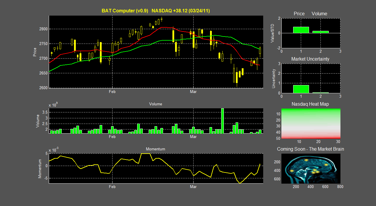
The 100 billion dollar question around Wall Street is and always will be, 'What is the next bubble?' In 2000 it was the .com boom that saw the NASDAQ rise to over 4,000 points. In the mid 2000's it was the real estate explosion that eventually led to the sub-prime mortgage collapse and the recession. If you ask most investment minded people today what they think the next bubble is, a large percentage would likely tell you that it's the social media .com bubble, and it's already forming. With the enormous valuations of Facebook and Groupon (both private for the time being), this claim is hard to argue with.

In this series of posts, I will try to quantify IF, and how much, this bubble is really inflating. We will use three measures taken with data over the last two years:

1. A side-by-side comparison of the stocks performance vs. the NASDAQ
2. The difference in percent change the stock price and the NASDAQ
3. A momentum measure defined as:
    Momentum = daily relative change in stock price* daily relative volume,
    then taken as a 50 day moving average.
    Any momentum > 0 suggest higher prices on higher volumes and any momentum < 0 suggests lower prices                       on higher volumes.

These three measures will give us a good idea of how quickly these stock prices are inflating in comparison to others, as well as the overall buying/selling sentiment in the stock. I encourage readers to suggest additional measures if they have any good ideas.

We begin with three of the biggest players in the field; Apple, Google, and Sina Corp.
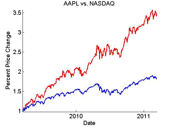
Apple (aapl) is an interesting case because it is not directly involved social media. Instead they build the hardware (ipads, iphones, itouches, itunes) that social media would be much smaller without. Nonetheless, the two are intricately related, and Apple is undoubtedly at the forefront of this field.

The direct comparison of Apple (red) and the NASDAQ (blue) is well known, Apple has been a market leader since the end of the recession.

What's even more impressive is that the difference between the two (top plot) has been steadily increasing as well, indicating that appl is further separating itself from the market. One worrysome indicator however, is that the momentum (bottom plot) has temporarily dipped below 0, possibly indicating a pullback in aapl stock.
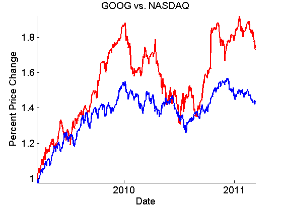
_________________
Next up is Google (goog), a major company that is primed to reap the benefits of social media, but has barely gotten its feet wet yet. Sure, the Android is a fine competitor to the iphone but a single device is likely not enough. Still, Google's failed buyout of Groupon last year shows that they definitely want in. Check out GoogleMe and stay tuned...more to come later on that.

The same analysis of Google shows a much more wild ride over the past two years,

Google (red) NASDAQ (blue)

where we definitely don't see the bubblicious qualities that marked Apple, but its performance is still impressive. This is perhaps an excellent indicator however of Google's lack of exposure to the social media market. But stay tuned, Google may be hopping on the train very soon.
_________________

Finally we come to Sina Corp. (sina) which runs a Twitter-like operation in China. 


Sina's performance is impressive, with a divergence from NASDAQ more than twice that of Apple's, and growing. Sina's momentum is also impressive (except for the past month), with a momentum peaking at 4 times that of Apple's. Sina's stock price is going exponential, the tell-tale sign of a bubble, but with no end in site yet.

From this snapshot, we can clearly see that, with the big boys, the bubble is surely forming. But three companies do not make a complete picture and there is a lot more left to study. Part 2 of this series will cover smaller-cap stocks that are more exposed to the social media market.

Thursday, March 10, 2011

The Share Strength Indicator: How much BANG is in your stock?

If you frequent investor websites, message boards, or pretty much anywhere on the internet, you’ve undoubtedly seen numerous ads tipping you off to stocks that are ready to EXPLODE with gains of 50%, 500%, or even 5,000%! Well 50,000% of the time, these advertisements are just pump-and-dump schemes ready to take your money instead. But is there really a way to mathematically measure the ‘explosiveness’ of a stock you may own, or want to own? In this post I’ll present you with a relatively simple technical indicator that can give you insight into the explosiveness of a stock. You don’t need a massive database of market info or a strong background in computer programming to implement this one. A visit to a website with historical data like Yahoo! and a working knowledge of Excel will do just fine.

The first question we need to ask is, ‘How much ground (price) has a stock covered in a certain day?’ The answer to this question tells how volatile the stock is, an important indicator of its potential to increase or decrease in price. The simplest measure of this is the difference between the high and the low prices for the day, divided by the open.

(Phigh – Plow) / Popen         
 
Unfortunately, this only tells us the percent range the stock has oscillated between throughout the day, not the actual price range it has covered. A better assumption uses the idea that stock prices follow a random walk (to a good approximation). Sparing you the gory details (read: Gaussian random walk), a better estimate of price range a stock has traveled within a day is

STDprice * sqrt(Volume).

The second term is just the square root of the volume for that day, and comes from the root-mean-square of random walk steps. The first term, STDprice , is the standard deviation of the price for the day, assuming a Gaussian distribution of prices. If we assume the price highs and lows for the day are 2 standard deviations away from the mean (for those worried about this assumption, it will just add an arbitrary scaling factor to the 
measure, which has no effect), then our new equation becomes…

STDprice * sqrt(Volume) = (Phigh – Plow) * sqrt(Volume)  / 4*Popen

We are almost there. If this equation gives us a good estimation of the price range a certain stock has traveled through in a day, then all we need to do is divide this by the volume of shares traded.  Multiplying this by 100 gives us the percent change in the stock price each traded share caused, or as I like to call it, the 
Share Strength Indicator (SSI).

SSI = 100* (Phigh – Plow) / (4*sqrt(Volume) Popen)

What this tells us is how much of an effect buying or selling a single share will have on the stock price. Let’s look at some examples and see how it works.
______________________________________________


We see, both with STEC’s epic 1 year run, and AVNR’s up and down rise, that the SSI (bottom, blue) did a nice job indicating the stock price’s (top, red) ability to move. Just before STEC’s run (early 2009) a trade of only 1000 shares (<$10,000) could move the stock 3%. This was a marked sign of illiquidity, and preceded massive gains in price.

So I’ve given you the golden indicator that will make you all millions, right? Umm… not quite. Keep in mind that this is a measure of volatility-per-share, or how much it will go up or down, not IF it will go up or down.


Here’s a case in point with DRYS. Notice how SSI took a nice little jump just before the epic fall in price and epic rise in SSI; the measure works both ways. Look below; it even identified some of the rises and falls of the great recession.


So how can you use this to make yourself money?  One obvious way is in options trading, with both a call and put option well outside of the money. One option will end up worthless but the other could increase N fold, always a good investment. Another potential application is when you are very confident a stock will go in a certain direction and you want to maximize profits. It also could be used nicely in combination with short data as well, maximizing the BANG of a short squeeze.  In the end, use it how you see fit. It obviously doesn’t work 100% of the time, and the SSI can remain arbitrarily high for any length of time. But, used properly it can be a nice addition to your technical analysis toolbox.

                                   Dr. Troy Lau

 (On occasion, I’ll present a new technical indicator that anybody can use to track equities. Feel free to use them as you feel fit.)